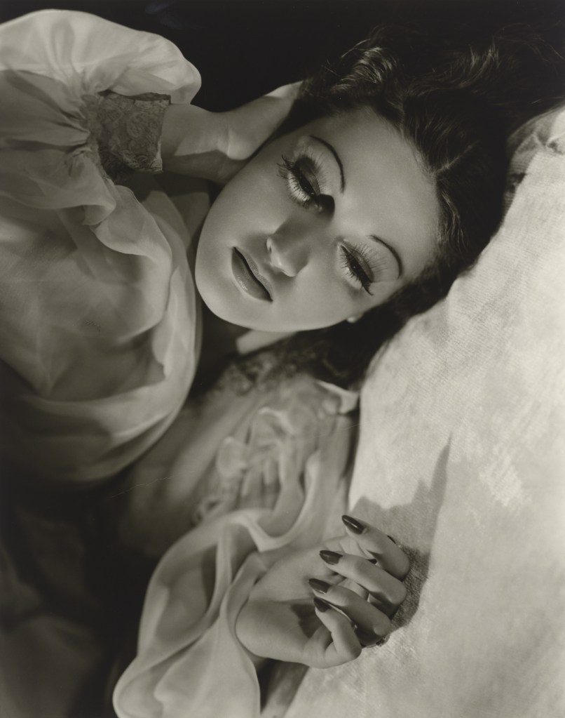
I will be in Washington DC a few more times over the next few weeks, so I decided to check out the current art exhibit lineup. If you recall, I went to the Star Power exhibition, featuring the photography of George Hurrell. I’m so excited to share that the National Portrait Gallery is featuring a sequel to that exhibition! Star Power: Photographs from Hollywood’s Golden Age by George Hurrell, has a new selection of 20 vintage photographs taken by Hurrell during the 1930s and 1940s. I remember how much I loved the previous photographs, and I’m thrilled that I get to experience more of Hurrell’s art when I visit the National Portrait Gallery. AND, fortunately for me (and for you, if you’re interested in visiting the museum) the exhibition will be on display until January 10, 2027, giving us plenty of time to plan a trip.
According to the museum, “The new selection of photographs will portray some of Golden Age Hollywood’s most memorable stars, including Constance Bennett, Joan Crawford, Marlene Dietrich, Douglas Fairbanks Jr., Clark Gable, Greta Garbo, Jean Harlow, Dorothy Lamour, Myrna Loy, Mary Pickford, William Powell, Basil Rathbone, Charles “Buddy” Rogers, Rosalind Russell and Barbara Stanwyck.” Particularly, I’m interested in the photographs of Rosalind Russell, Basil Rathbone and Joan Crawford, though I’m sure I’ll enjoy each of the photos.
I know I do the absolute most sometimes, but it’s one of the few things I really enjoy about myself. In my major bursts of activity, I can usually get a lot done and, when I inevitably need to hibernate and restore myself, at least I have a ton of content already created.
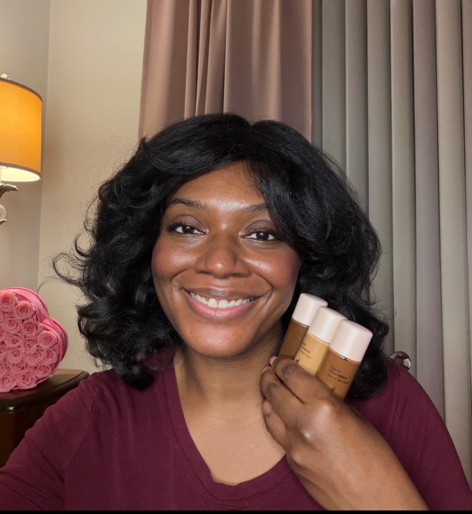
In the next few weeks, I’ll be sharing a video on some Dollar Tree foundations that I tried. Spoiler alert: all of the shades I bought were too deep for me with the exception of one, and that one was too light for me. It doesn’t really matter, though: I bought the foundations to swatch them for all of the brown-skinned girls. So it was worth the investment.
Mineral Fusion foundations from the Dollar Tree
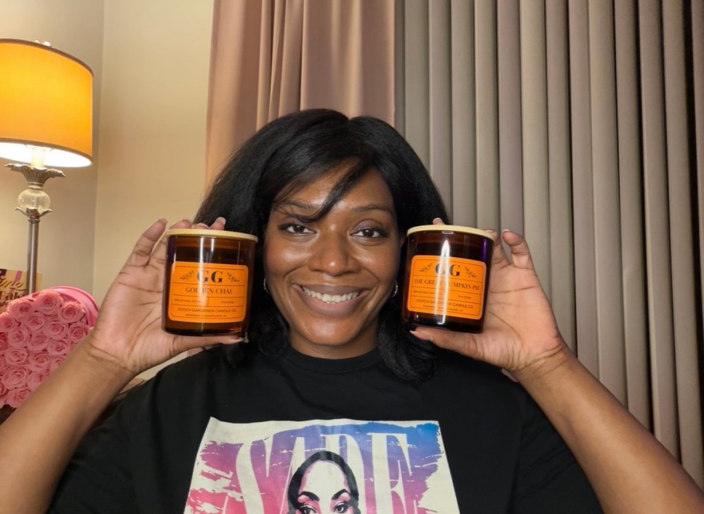
Next, I reviewed some candles from The Gooch Gardener (I’ve reviewed them here). At this point, I now have 3 Gooch Gardener candles that need written reviews, because even though I think I did a good job discussing them, I find that I always have so much to say after the video is published. I love that blog posts can capture those thoughts that escaped me during filming.
Then, I have a video coming, discussing The Hollywood Collection‘s going out of business sale. I purchased two rings previously, but I went back to the website and got three more. Another spoiler alert: I love these, too. I wanted to make sure that video got out sooner rather than later, since time is of the essence. That one, along with the candle review, should be coming out within the next seven days.
My three rings from The Hollywood Collection
Finally, I filmed a video on a fragrance I’ve been enjoying all summer and didn’t discuss. Fenty Skin Body Start’r Mini Trio introduced me to the company’s Vanilla Flowers scent, which I absolutely loved and wore a number of times. I can’t wait to share my thoughts on that fragrance and let you all know what I thought of the body mist, bubble bath, and body wash.
As the videos are published, I’ll add links and longer posts for each. I just wanted to give you all a quick heads up and have you on the lookout for some new content over on my YouTube channel! Thank you all for supporting me: you have no idea how much it means. Besos!
Several months ago, I went to the National Portrait Gallery and enjoyed a beautiful exhibit featuring women artists who spent time in Paris during the first half of the 20th century. however this exhibit was not the only one that caught my eye while at the national portrait gallery. Not very far from one of the main entrances was a hallway devoted to the glamorous photos of Hollywood stars taken by George Hurrell. His work perfectly captures both the beauty and mystery of these stars of the Hollywood Golden Age. Here are some of my favorite photos from the exhibit. Enjoy!
This photo of the radiant Jean Harlow greeted visitors to the corridor of photographs
Background information on Hurrell
Dashing Douglas Fairbanks Jr.
This is one of my favorite photos of Gypsy Rose Lee
Earlier this year, I took one of my longest vacations (ever): I spent 20 days enjoying London and a transatlantic cruise aboard Cunard’s Queen Anne. The London leg of the trip was fantastic, because London is amazing. Trips to Harrods, Harvey Nichols and Zedel are always on the agenda, but this trip was marked by an even more spectacular activity: I got to see the live production of, The Devil Wears Prada.
Let me start this story by giving a little background. This trip was initially scheduled for a different set of weeks, but my friend had to change the dates to accommodate some new obligations. We had already purchased our tickets to the show, and we feared that we wouldn’t be able to exchange them for a different date. Fortunately, the gracious box office at the Dominion Theatre refunded the tickets and we were able to secure our seats for a different night (imagine trying to do that kind of adjustment here in the US: impossible!)
Fashions inside the theatre
We went to the show and it was INCREDIBLE! The music, the fashion, the overall story, and the diamond in the crown of this production: Ms. Vanessa Williams as Miranda Priestly. She is ethereal, and her voice is perfect. The whole cast was absolutely divine, but I particularly enjoyed the actress playing Emily, Amy di Bartolomeo. Every note, every scene, every accessory was chosen with care. I particularly enjoyed a scene where the ensemble cast came out and were wearing the colors of the French flag (bleu, blanc et rouge), and they were careful to walk in a way that kept the blue first in the lineup (lest it be confused with the red-white-blue flag of the US). Those kind of details are plentiful in this production, and it would be fun to see the show several times, just to see how many of these details I can spot.
Seen as we exited the show
The music was fantastic, the venue was convenient, and the performers were all perfectly cast. My only regret is that I didn’t buy tickets to see the show one more time before I left London! If you’re able to see it, I highly encourage you to do so. Because believe me, the Devil wearing Prada has never been more beautiful!
Recently, I visited one of my favorite museums, The National Portrait Gallery in Washington DC. This museum is located right by Chinatown in downtown, a stone’s throw away from Capital One Arena. I was in the area while one of my friends visited from Atlanta, and we took advantage of a sunny afternoon and explored downtown DC on foot. She had never visited this museum before and, since the Portrait Gallery shares a building with the Smithsonian American Art Museum, I thought it would be a great time to visit both. I also got a chance to show her one of my favorite sculptures, The Death of Cleopatra by Edmonia Lewis (I wrote about this breathtaking work in this post).
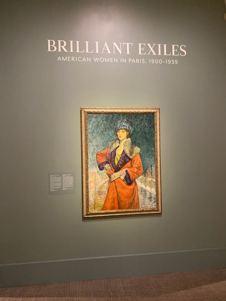
As it just so happens, the museum had two exhibitions that were perfect for our artistic preferences. In this post, I’ll discuss one of those exhibitions (I’ll share the other exhibition in a separate post). Brilliant Exiles: American Women in Paris, 1900–1939 is a stunning collection of works from the various genius women that found themselves living in Paris pre-WWII for the same reason. Paris, during this time, was progressive enough for female creatives who wished to hone their crafts, giving them an environment to do so without the stigmas, pressures, or expectations of life in America. The women were often in Paris for art school, but ending up in some cases staying longer than expected, so they could continue to enjoy the freedom that Parisian life offered.
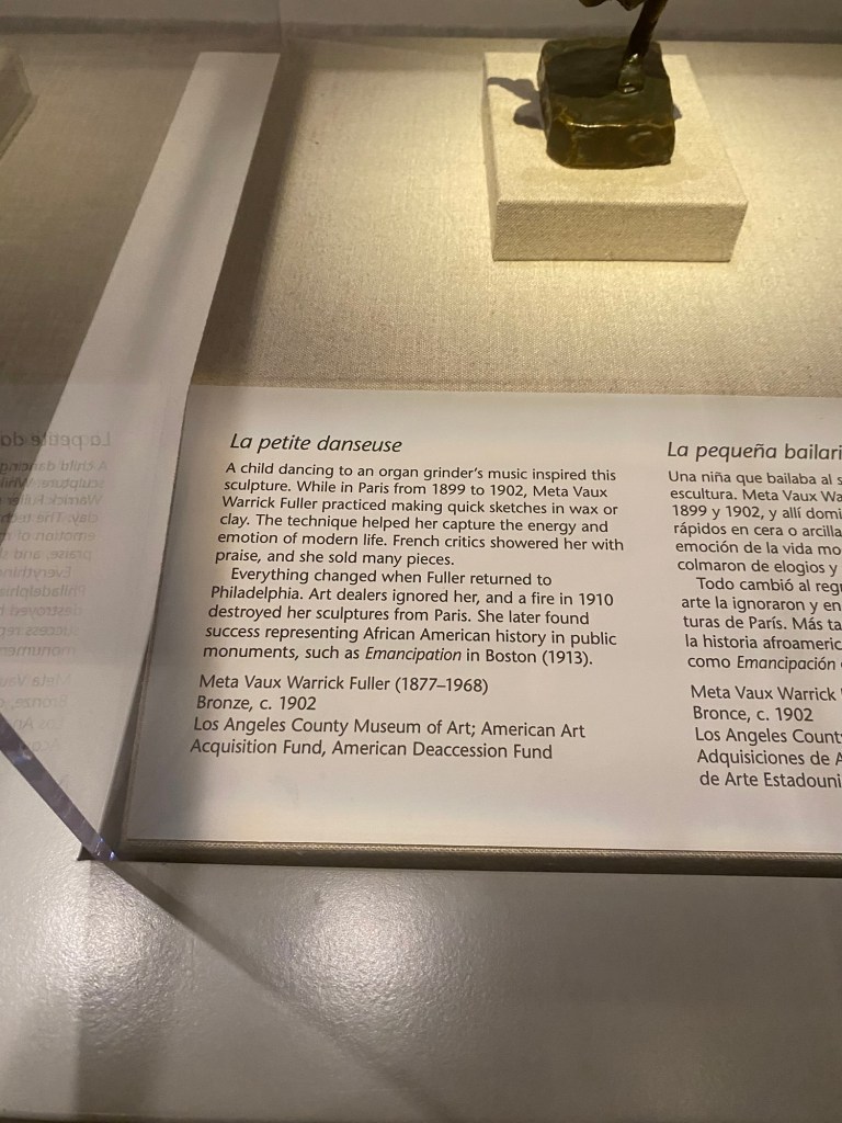
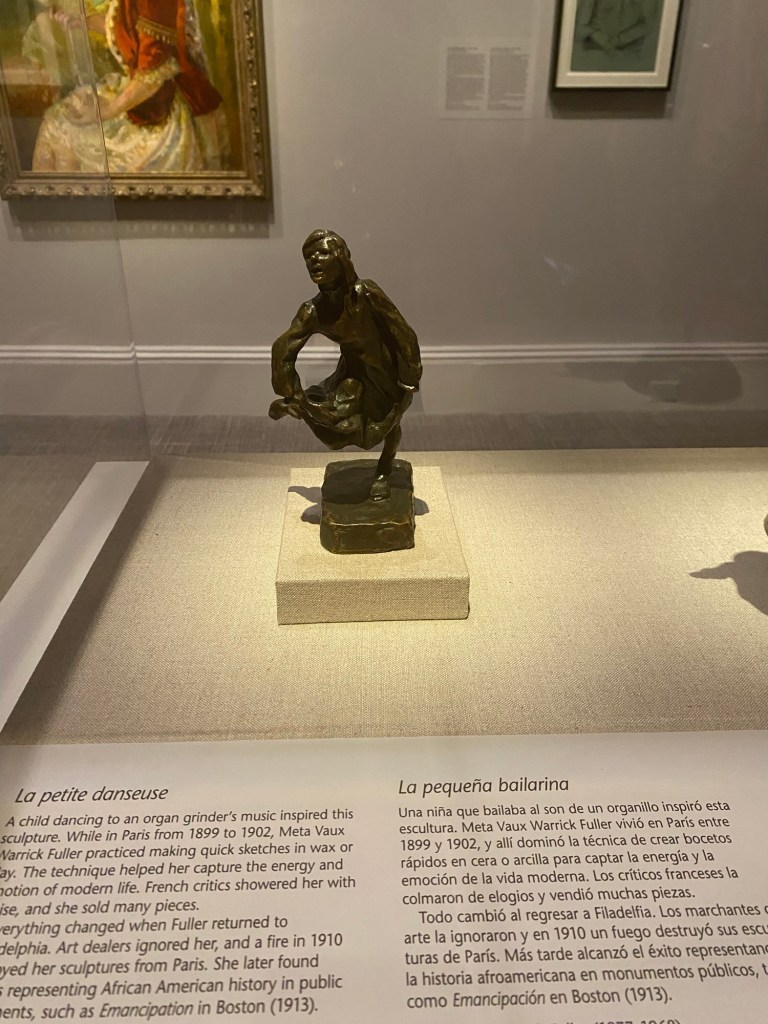
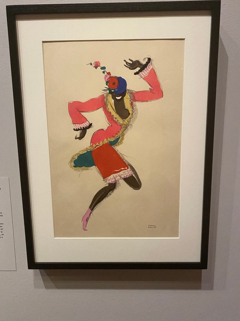
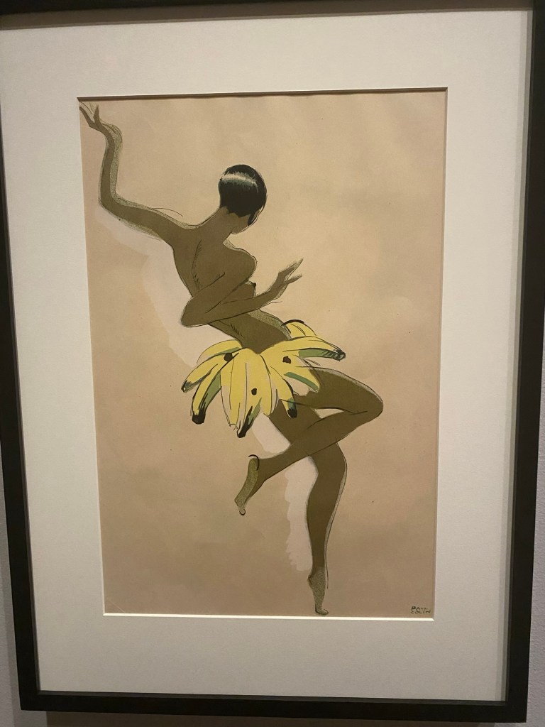
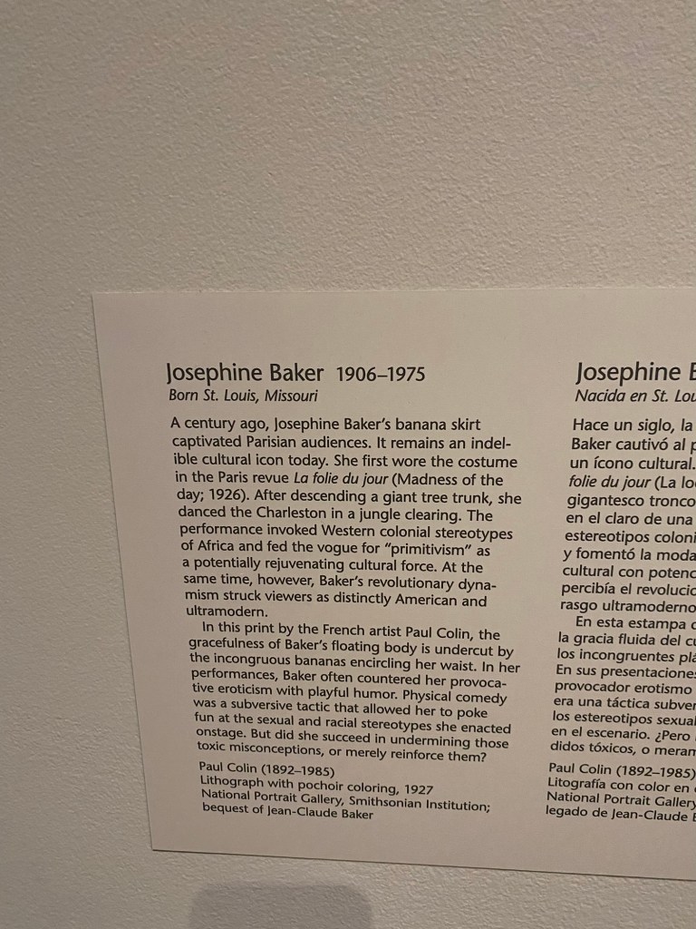
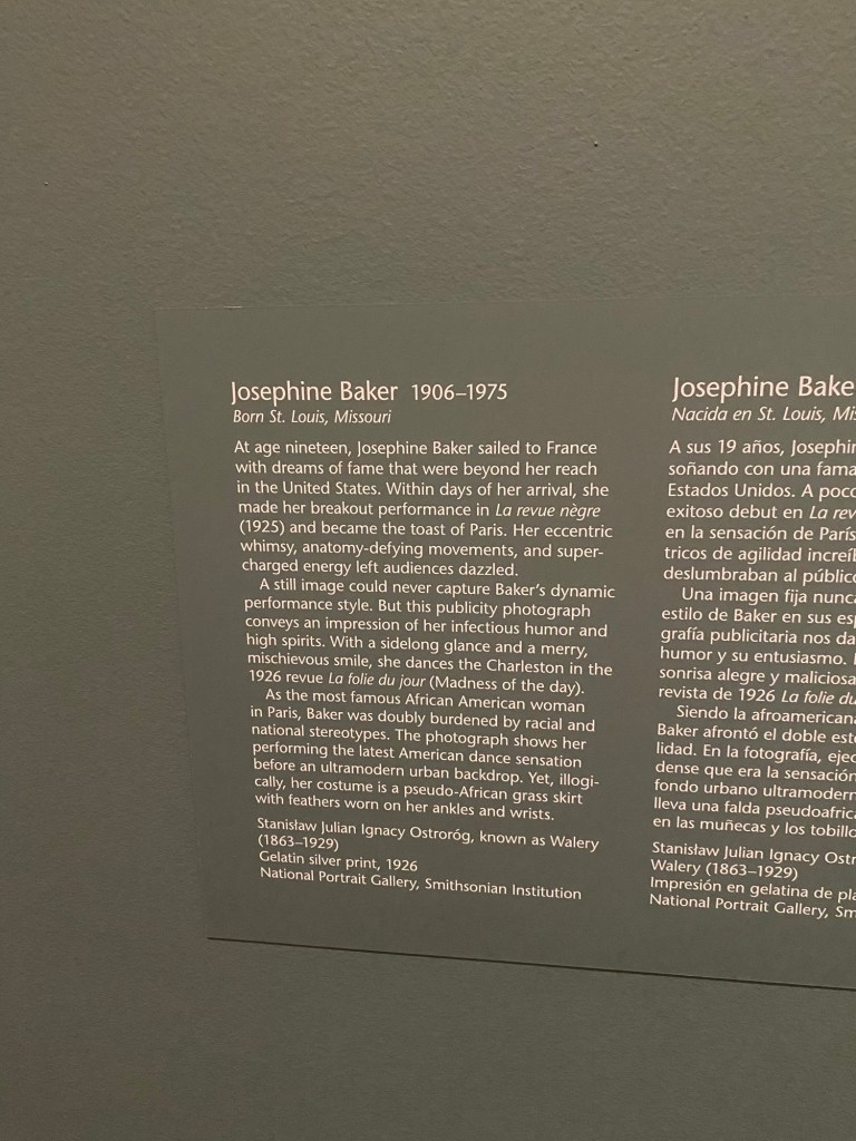
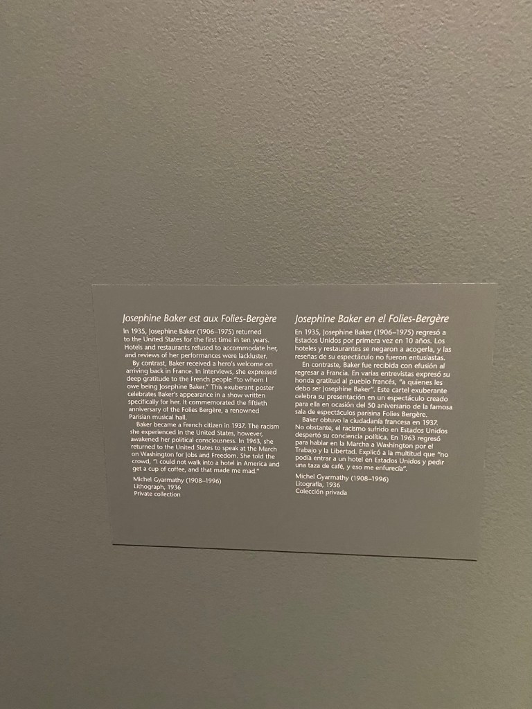
I focused on the Harlem Renaissance section of the exhibition, since this period fascinates me and offers many relevant lessons for creatives in the current day. I was thrilled to see some of my favorite artists represented in the collection, including Lois Maillou Jones, Augusta Savage, and Meta Vaux Warrick Fuller. And, naturally, no exhibition about the Harlem Renaissance would be complete without a Josephine Baker feature.
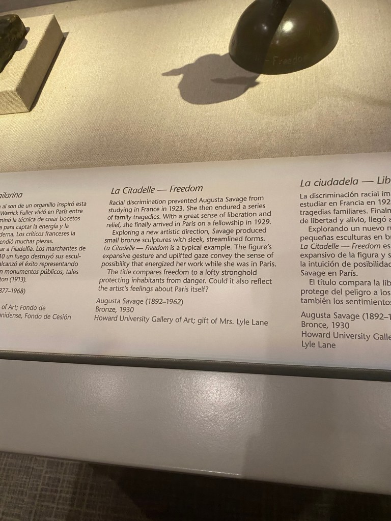
Sculptress Augusta Savage
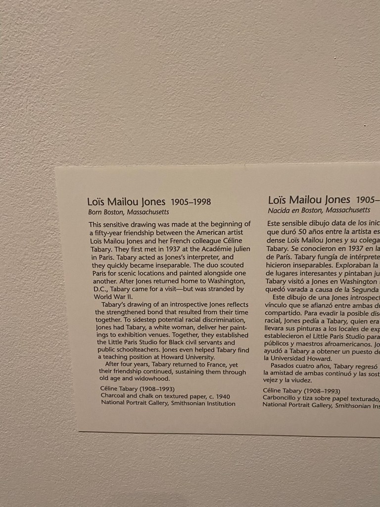
Sketch of Lois Maillou Jones
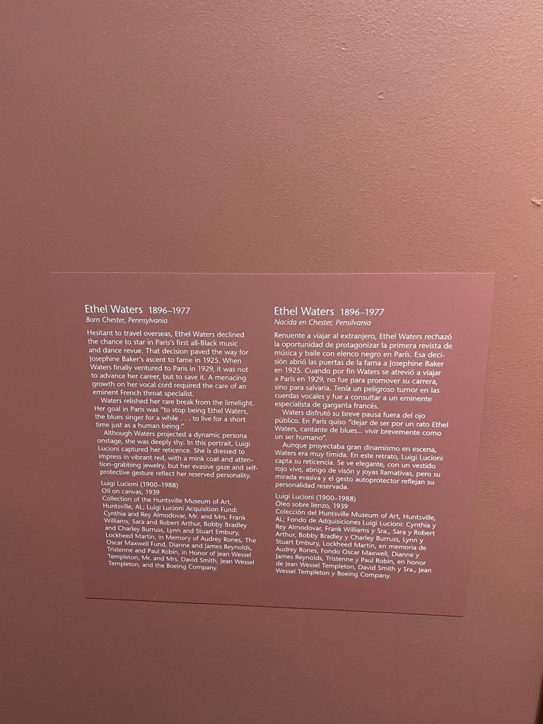
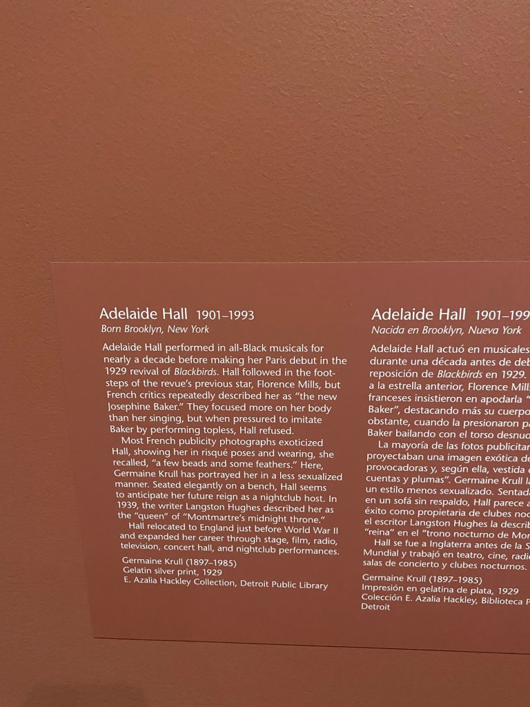
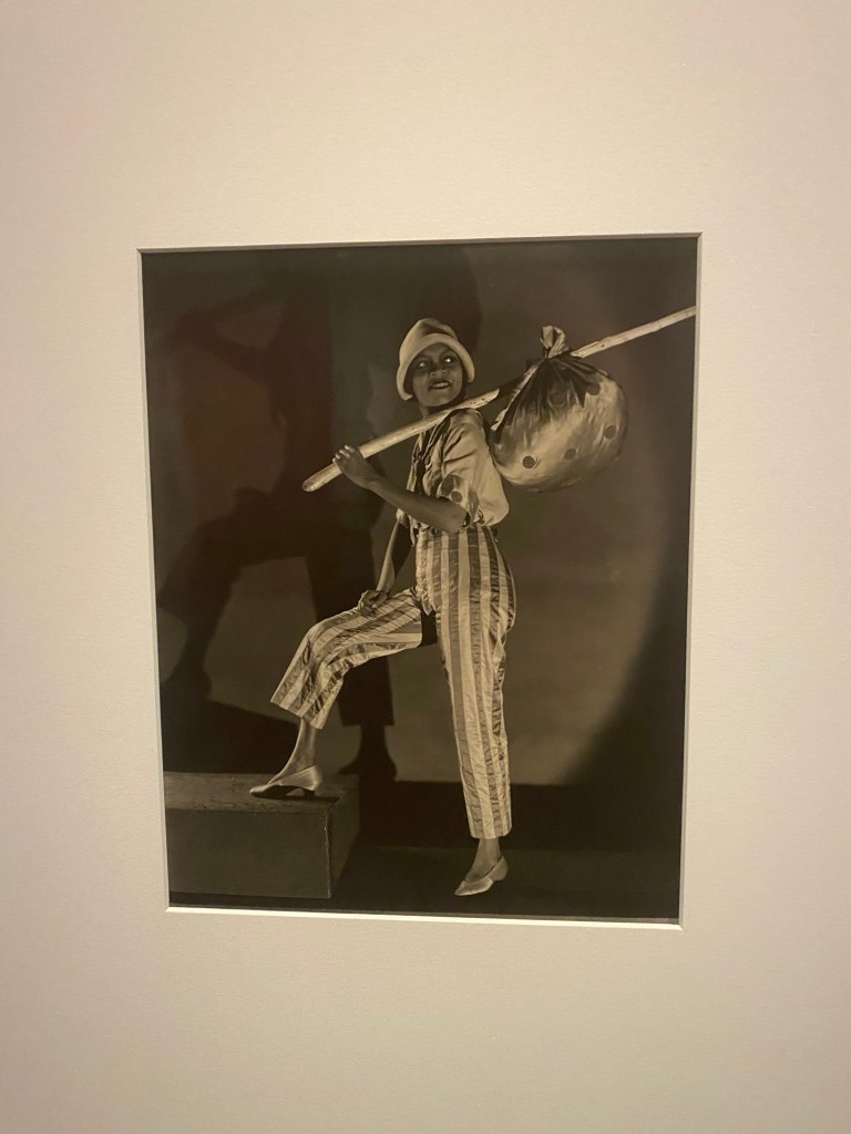
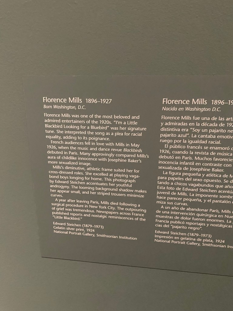
I was delighted to see other singers that are sometimes overlooked during the conversations around influential vocalists during this period. Florence Mills, Nora Holt, Adelaide Hall and Ethel Waters were also highlighted in this exhibition, which was a refreshing surprise.
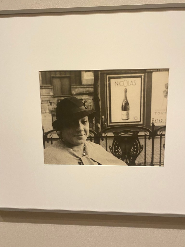
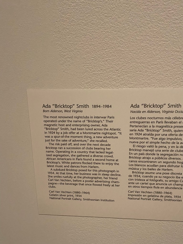
I was tickled to see a photograph of one of my favorite jazz-era entrepreneurs, Ada “Bricktop” Smith. Her Paris nightclub realized a level of success that Smith could have not even fathomed in America. I love that her entrepreneurial spirit led her to a foreign country, where she enjoyed a long and fruitful career.
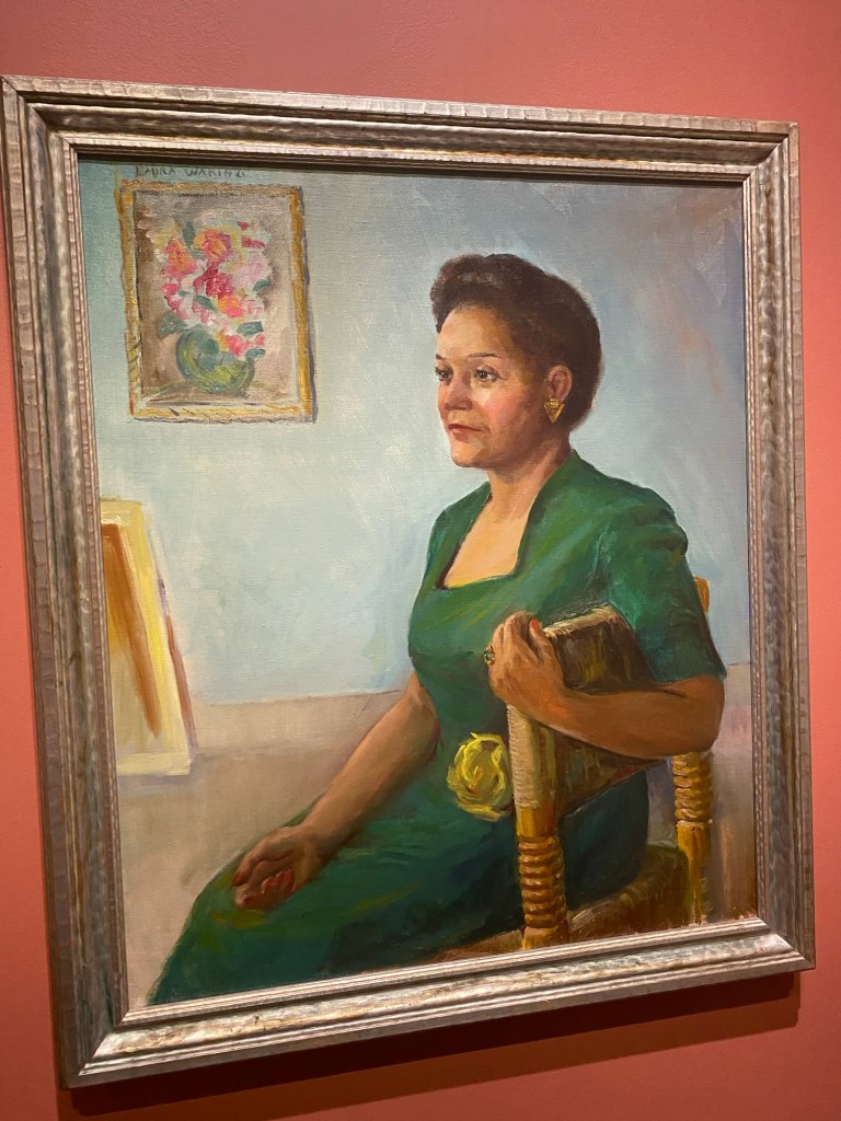
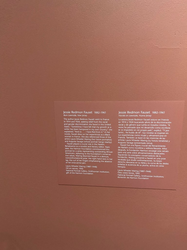
This collection also introduced me to Laura Wheeling Waring, an African American female portraitist that captured some of the most brilliant women of the time. I fell in love with her portrayal of Jessie Redmon Fauset, the poet and literary editor of The Crisis, a magazine that published the works of a number of Harlem Renaissance greats (such as Langston Hughes, Claude McKay, Nella Larsen, and many others).
Jessie Redmon Fauset by Laura Wheeling Waring
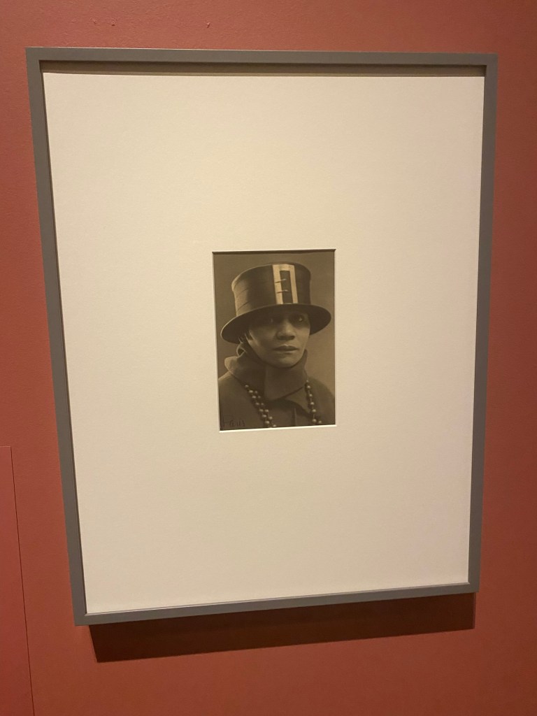
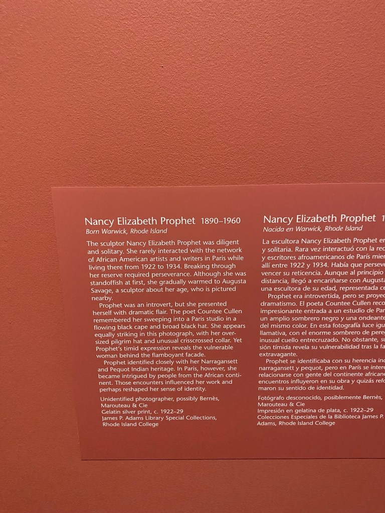
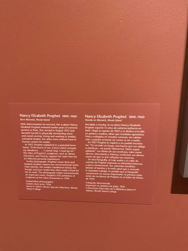
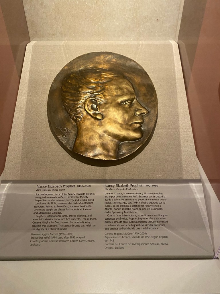
The exhibition also re-introduced me to Nancy Elizabeth Prophet, a sculptor that I’m excited to learn more about. I was captivated by her story, especially her diligence to her craft. She was so devoted to sculpting that she suffered through extreme poverty and physically demanding tasks (like carving stone and wood) in France, just to ensure that she could bring forth the art she desired to create. These hard times took a toll on her, but her efforts paid off, and she enjoyed success during her lifetime.
It warms my heart to know that, during a period of time where Black women in America were often pigeonholed into careers that were neither financially nor emotionally fulfilling, there were some brave and fortunate women that got to leave the States and experience peace and freedom in Paris. I am blessed to see portraits of these women, and even artwork that they created, during this exciting time in history.
The exhibition runs until February 23, 2025. I hope you all get a chance to check it out!
One of my favorite ways to embrace and engage my senses is to wear perfume pretty much every day. I’m always curious about trying new scents: I’m fascinated with how various notes interact with one another, and then how they combine with my own chemistry to create a personal scent signature. A recent trip to Ulta introduced me to Eilish No. 2: a warm, earthy fragrance that’s unlike anything else I’ve ever tried.
Eilish No. 2 is the second in Billie Eilish’s collection of scents, and this one did not disappoint. I smelled the first perfume she released (Eilish Eau de Parfum) and, while I enjoyed it, I didn’t feel confident that the scent would give me the wear time and sillage I desired. I like my fragrances to last a long time but also to project a bit, so I can be enveloped in my preferred scent. Though the first Eilish scent didn’t seem like it would fit my criteria, Eilish No. 2 impressed me right away. I love how this scent has depth but isn’t the typical spicy amber or gourmand: it’s warm and woody, a striking balance between earthiness and sweetness that I’ve rarely experienced. The notes for this scent are as follows:
Top: Bergamot, Apple blossom
Mid: Black pepper, Papyrus, Poppy
Base: Palo santo, Ebony, Vanilla
One look at these scents and you can see what I mean: dry spiciness (courtesy of the black pepper) crisp, fresh slightly tart top notes, and the warm woody base that is sweetened just a bit with a vanilla that is neither syrupy nor sickly. I wore this scent and it lasted all day, and the sillage was fantastic. I loved it! Here’s my video reviewing Eilish No. 2:
This is one of my favorites! I got the 1.0 fl oz (30 mL) size for $52 USD. It’s a bit heavier than I usually wear during the summer months, so I’ll be putting this one away until the cool weather returns. If you’re looking for something different, this one may be worth checking out!
We’re discussing Style Thoughts by Rita’s Four Essence System again, because I’m fascinated by how this system explains the energy and soul behind personal style. There are four tools within the Four Essence System (I’ve already discussed tool # 1 here). Today, I’m on to Tool # 2 – Archetypes. The section of the video that broadly talks bout archetypes is found at minute 3:33.
Anyway, I’m exploring archetypes that fit my Right-Up essence. This quadrant contains women that tend to have a regal energy, that can run the gamut from intimidating to adorable. The keywords for Right-Up women that resonated most with me were Luminous, Refined, The Sun, Effort, Persona and (in my mind) Glamorous. Building upon those keywords, I took a look at the archetypes to see where I fit in. Fortunately for me, Rita has already posted a video explaining the five archetypes within the Right-Up quadrant.
The archetypes for this quadrant are the Role Model, the Icon, the Priestess, the Power, and the Playful Dame/Princess. I knew, immediately, that the Playful Dame/Princess did not suit me: I don’t have the girlish energy needed to pull off this archetype. The next archetype I struck off of my list is the Power: while I do feel energetically powerful, I don’t think this is an energy that I project well out into the world. My friendly Southern nature makes it hard to have the intimidation needed to embody this archetype well.
The process of elimination left me between two archetypes: the Icon and the Priestess. I most resonate with Icon, because there is a level of mystery and ceremony with the Priestess that doesn’t suit my personality and energy. When describing the Icon, Rita says, “Her style is an extension of her mission in the world”, and, “the main thing […] is this willingness to be seen and have this comfort with your power”. As someone who has studied personal style and is constantly implementing strategies to refine and perfect the image I want to communicate to others, I can confirm that I use my style as a calling card for my mission, and I also use it as a support when communicating who I am to others.
In short, the Icon is ME! I love this archetype and I enjoyed how Rita emphasizes that the celebrity examples she uses in her videos aren’t there to show anyone “what to wear” for their archetype, but to determine the role that personal style plays in their lives. It’s this desire to understand how style supports us that drives the need to uncover our archetypes, and I’m thankful that Rita has created such great content that explains these things in depth.
That’s all for today. Take care, and I’ll talk to you all tomorrow!
Here are a few images of the most opulent things I’ve seen in the past week. Just thought I’d share these divine Faberge eggs that I saw at Virginia Museum of Fine Arts. The eggs are exquisite works of art that capture the idealized beauty and fragility of the Russian monarchy. I love that these objects represent the intersection of history, art, and culture. Cheers to opulence and abundance!
Here’s the post that went up prematurely a few weeks ago: it’s all fleshed out and full of pics. Enjoy!
A couple of months ago, I discussed Grace Kelly’s impeccably elegant style, and I found it extremely helpful for my own style journey to apply an analytical lens to her style choices. It’s been a while since I did a Kibbe style chat, and this particular star’s style has been a favorite of mine for years. I figure that there is no time like the present to discuss another Soft Classic (SC) beauty, Marion Cotillard.
(Image courtesy of Archive.org)
The effect: Old Hollywood Revisited
Marion is an established actress, winning numerous awards for her portrayals. I find her fascinating, as she is often on what I consider the “outskirts” of pop culture. She is undoubtedly talented and popular, but she doesn’t appear on the gossip sites or other media outlets focusing on the shenanigans involving some A-listers. She’s “in the world [of Hollywood] but not of it”, for lack of better expressions. Marion has all of the perks of the A list but none of the embarrassing trappings. Clearly, she prefers remaining as discreet as her level of fame will allow. I admire her for this!
Marion’s philosophy of discretion over being outrageous for the public’s consumption is seen in her sartorial selections. She often keeps a simple silhouette with her hair, makeup, and clothing, though she occasionally takes chances with her appearances. Starting with her hair, it’s clear to see that Marion enjoys wearing her natural dark hair color. Her brunette locks perfectly complement her coloring, so she looks tremendously harmonious when wearing dark hair. Her hair is always quite glossy (which makes the color appear even more luscious) and is usually in a medium- to slightly-long length bob with a bit of curve. Her hair usually doesn’t have stiff curls, just a lovely curvature of the ends.
Marion with a slightly shorter crop but still very clean and classic lines (screenshot from video on Archive.org)
Sometimes she’ll do much longer lengths, which can give her an even more glamorous appearance. Her best looks are always very tidy, or, if slightly tousled, it’s a very calculated effortless look that doesn’t appear messy at all. What’s really fascinating is how “older” (more vintage inspired) hairstyles look tremendously modern on Marion. As a SC, she has a very balanced face that looks quite timeless, and the same hairstyles that looked marvelous on the SCs of yesteryear (like Grace Kelly, Merle Oberon and Donna Reed) look just as fresh and beautiful on Marion. In my humble opinion, the prettiest looks worn by Marion are the hairstyles that look like they are right off of the pages of a 1940s styling guide.
Marion as photographed by Studio Harcourt Paris, 1999 (edited by MaterialScientist)
Marion’s makeup tends to be quite soft and simple. She will occasionally experiment with more intense looks, but she looks effortlessly and polished when she works within the makeup recommendations as outlined by Kibbe. Marion’s most incredible looks use gently defined features, with eyes and lips matching in intensity. The “watercolor” makeup approach (as advised by Kibbe) looks marvelous on her, giving her features some distinction but doesn’t overwhelm her balanced overall effect.
Marion in her signature cosmetic colors (photo by Georges Biard)
Finally, let’s discuss clothing. Marion looks heavenly in symmetrical ensembles with soft touches here adn there (the best look for SC). What’s really cool is that she will experiment with looks that are better suited for other style IDs, presumably because SC clothing is often “boring” to the SCs that wear them. (Sidebar: as a SC, I understand how “boring” it can be to stay within the style recs for this ID. The trick is to add one element of different IDs while keeping the rest true to our ID.)
While regularly wearing SC clothing can feel “boring”, it is really the best canvas for seeing the naturally balanced features within the face and body. When Marion sticks to her ID, she looks heavenly. She looks incredible when she wears clothing that looks like they are directly from the Golden Age of Hollywood. Symmetrical silhouettes that fall anywhere from the knee to the ankles are smashing on her, though she occasionally plays with a mini-skirt ensemble (these look cute on her when the mini-skirt is a bubble style). Sheaths, shirtwaist dresses, and A-line ensembles are perfect on her, so long as there are soft touches that honor the yin in her frame. High quality fabrics that are neither too heavy or too flimsy suit her well, and wearing colors that are consistent (no fading) and an appropriate level of saturation (she can handle a bit of color intensity) are best.
Marion looks gorgeous in a simple dress that honors soft classic lines (screenshot from Archive.org)
For Marion, she would do well to ask WWGW: What Would Grace Wear? The most flattering looks I’ve seen on Marion look like they were plucked from the Princess of Monaco’s wardrobe. However, she should avoid using the same color palette of Princess Grace: Marion’s coloring looks divine with Soft/Cool Winter colors, while Grace is a Summer, which, funny enough, is the lighter side of Winter colors. Marion could literally replicate most of Grace’s ensembles, make sure the clothing is in the Winter coloring range, and it would look fresh and modern, while still giving a nod to classic roots.
Wearing muted colors that straddle the line of summer and winter palettes, but still looking beautiful. (Georges Biard)
The difficulty of modern celebrity wardrobes is that there are many stylists that don’t “curate” signature looks like the old Hollywood machine used to do for its stars. For that reason, I think Marion does a great job of creating a style profile that has way more “hits” than “misses”. I also appreciate that she enjoys having fun with her appearance and doesn’t stick strictly to the silhouettes that are recommended to SCs. Even if her style risks are occasional “misses” to the public eye, so long as she’s having fun, it really doesn’t matter if others disagree with her choices.
That’s all for my style analysis of Marion Cotillard. Do you like her ensembles? Let me know what you think!
Recently, over on my YouTube, I’ve been experimenting with a lot of fragrances. I love the transformative power that can be experienced by changing the scent you wear: the right perfume can make you feel invincible!
I decided to research some of the fragrances worn by old Hollywood stars, and I was really excited to discover the fragrances worn by some of my favorites. I researched these scents and I found that some of them were extremely affordable. So I figured, “Why not?” and bought some bottles.
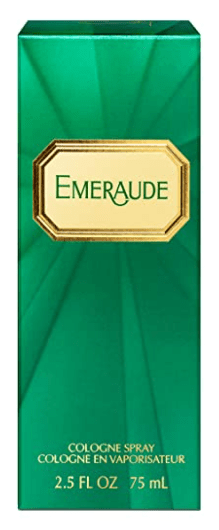
The first scent I purchased was Emeraude by Coty. This was the fragrance preferred by none other than Lady Day, Billie Holiday. The notes of the fragrance are as follows:
Top notes: Bergamot, Lemon and Orange
Middle notes: Brazilian Rosewood, Ylang-Ylang, Jasmine and Rose
Base notes: Opoponax, Benzoin, Vanilla, Amber, Sandalwood and Patchouli
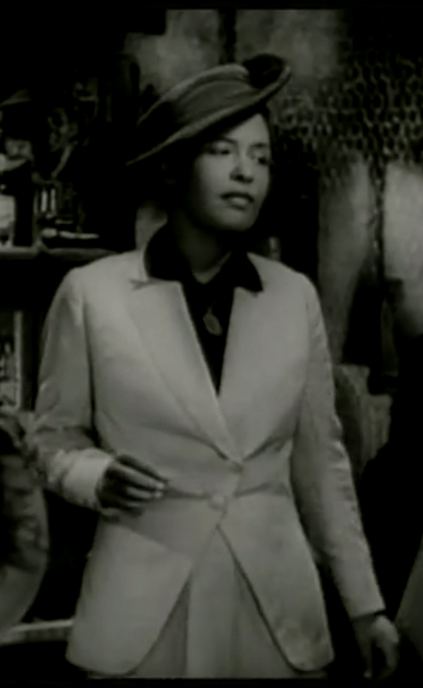
Lady Day herself, Billie Holiday (as seen in the movie New Orleans)
This fragrance is peculiar to me: not in a bad way, but in a good way. The perfume is citrusy before and immediately after spraying, then it quickly diffuses into a soft but earthy bouquet, and dries down to a warm and slightly sweet essence. The peculiar part is, throughout all of this, the perfume retains powdery notes, which I didn’t expect. When I first read the list of notes, I figured this would be bright, spicy, and then mellow. So to have the essence of baby powder lingering while wearing it was completely unexpected, but nice.
I have more information about the scent in the YouTube video, which I’ll insert below. But, you can always pick up a bottle to try it for yourself: it was less than $12 USD (I’ve seen it sold for as little as $9) so it is extremely accessible and, if you don’t like it, you can probably easily resell it or give it away. Full disclosure: while this is powdery and rather soft, I find it does smell a bit . . . dated (the formulation is over 100 years old!). This is definitely for someone that wants a unique scent that isn’t syrupy sweet or overwhelmingly floral. Also, this is a cologne spray, so it won’t have the same longevity as, say, an eau de parfum. So if you love it, prepare to refresh your fragrance at least once during the day. But at $9-12 per bottle, using the product more frequently probably won’t be a huge issue.
That’s it for today! I hope you all are having a great week, and I’ll talk to you all tomorrow. Take care!